At Colourless Green, we not only strive for accuracy of numbers and figures, but we’re concerned about painting the right picture. Visualisations interact with our intuition as humans, and we only pack in multiple dimensions when absolutely necessary.
The following four samples are of our work over the years. Most data engineering work is not really visual. Auditing data, re-forming columns; doing logic puzzles is less visual than I would like. And especially when you’re working with companies like I do that have core competencies in copyrighted secrets, I’d be violating integrity by sharing such a private thing. But the following examples are dashboards I developed and abstracted from the original data using other data I scrubbed and anonymised.
Logistics mapping
From customer shipments to redundant procurement to saving money on less-than truckloads, we can help viz what is your current state, show you an ideal supply chain, and quantify the savings for that idealised state.
The following example shows a network that is not optimised, compared with the optimisation techniques that Alteryx can provide for clients. For best performance, we recommend viewing it as a full-screen.
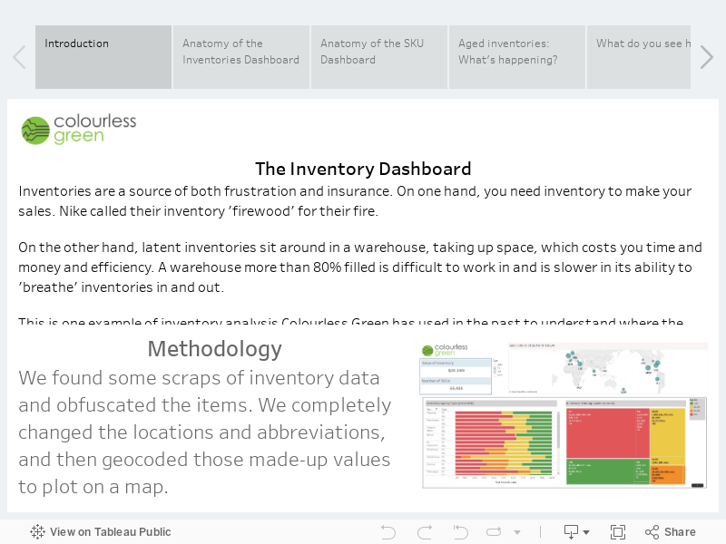
Inventory Ageing
The following is an example of an interactive inventory ageing dashboard. As is the case with all data analysis, it is completely dependent upon the available data. In this case, I found some scraps of data and used some random numbers to assign the inventory bins. I also changed the locations to make it more global.